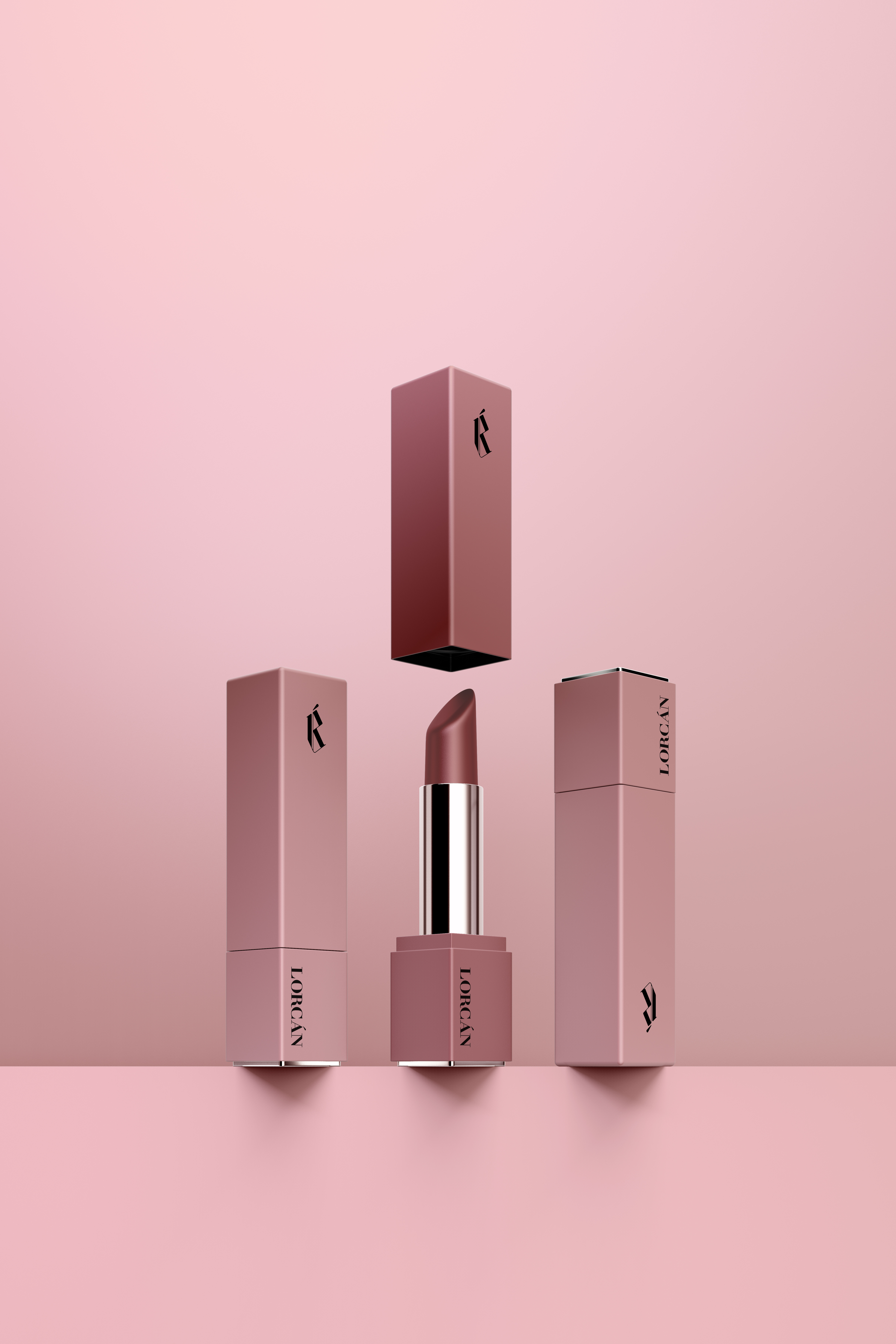
LORCÁN
client:
Daphne Apostolidi
range of work:
name-giving, branding, corporate identity
year:
2020
Daphne Apostolidi
range of work:
name-giving, branding, corporate identity
year:
2020
Lorcán is a cosmetic line with quality products that want to make you feel beautiful. The name Lorcán means the little fierce one and is inspired by the dynamism of the modern woman.
For the final logo, the basic consonants of the name were used: L, R and the characteristic dashed A.
The austere character of the mark is inspired by the Gothic alphabet and the banners carried by warriors in the past. Alternating line thicknesses lend femininity and elegance to the logo, with vertical lines promoting a sense of movement and progression.


